psa: making your site mobile friendly is pretty easy actually
31/07/2026i know that some people relish in their site being desktop only as a hearkening back to the myspace and geocities days or a rejection or convenience or smartphones or something, but imo a responsibility attached to having a website is to make the thing at least somewhat accessible to people in different situations. "optimised for desktop" normally means "i expect you to be looking at this on a 1920 x 1080 display and the site will be nigh-unusable if you want to do something crazy like put your browser side by side with another program on your one screen. it also can cause issues for people viewing your site on an ultrawide or high-resolution display, although most of the templates that the average small webber use handle this with a maximum width. anyway! i thought i'd just do a tiny intro to how i organise my page elements to handle the different displays that visitors might be using
first and foremost, you can check out my website's source code here - i use 11ty to speed up the process of making new posts, but the guts of the site is still just html and css. the styles specifically are here. the layout of my site, as far as this tutorial is concerned, is just this:
<head/>
<body>
  <main/>
  <aside/>
</body>
the body tag is a core html element, the main is the "body" of the site aka the box you're reading from right now, and the aside is the navigation bar. the contents don't immediately matter, although you will need to be smart about how theyre laid out in different sizes (my navigation bar swaps from a column to a row when the screen gets narrow, for instance)
in any case, the css that lays all this stuff out is really simple. the first bit is here
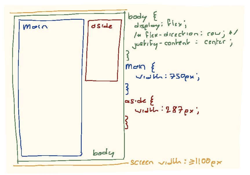
i've set my <body> as a big flexbox - note that i don't actually need to specify a flex-direction, as the default is row. i've also set an explicit width to both the <main> and <aside> tags - my aside is a weird arbitrary seeming size to effectively fit my funny little gif by the ever wonderful dav-19 . i also have a currently-imaginary lower size limit of 1100px, which is a little bit more than 750 + 287. this means that i'll never have to think about resizing the main or aside if the screen gets too small. finally, the justify-content lets you center these two segments on the screen without any extra fuss. no matter how wide the screen is, the site will serve these two blocks in the middle of the viewport
next up, we have my media tag, which you can find here. the syntax is a bit weird, but it will basically trigger when the viewport width is less than or equal to 1100px. theres only a few important styles here:
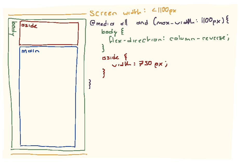
first up: i'm reusing my aside tag and using it as a header. this is handy because i only need to define my list of links once, and going through a little bit of styling pain means i dont need to hide and show different elements and then make sure they all look right etc. theres no shame in doing it that way though. i'm able to do this little bit of magic using flex-direction: column-reverse;, which lets the site (bizarrely) reverse the order of elements, using the last element as the first. you don't need to do this if your navbar is on the left, but hopefully it gives you an idea of the amount of freedom flex uses - you can even set completely arbitrary orders, but that's a lot more fiddle.
finally, we just set the width of the aside to the same as the main, defined previously. we've only defined width instead of max- or min-width, which means that as the screen shrinks below 750px the elements scale smoothly with it. how painless!